Toast notifications are small messages that appear temporarily to inform users about actions or events — like successful submissions, warnings, or errors.
While libraries like React Hot Toast and Sonner exist, building your own custom toaster gives you flexibility and control over style and behavior.
In this snippet, we’ll build two versions:
- A simple single toast popup.
- An enhanced stacked toast system that supports multiple toasts.
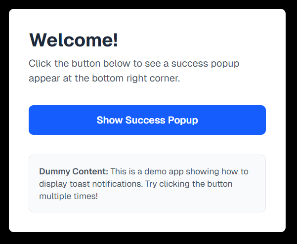
🧩 Single Toast Popup
Let’s start with a basic version that shows only one toast at a time.
🔍 How It Works
useStateholds a single toast object.- When the button is clicked, a toast is created and displayed.
setTimeoutremoves it automatically after 3 seconds.- The toast appears in the bottom-right corner of the screen.
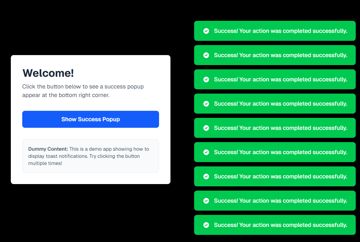
⚡ Stacked Toasts (Multiple Notifications)
Now let’s improve our toaster to handle multiple toasts at once — ideal for apps where multiple events can happen rapidly.
We’ll create two files:
- Toast.jsx → manages the
toastsarray - ToastCard.jsx → displays each individual toast
🧩 ToastCard -
💡 Step-by-Step: How Toast Stacking Works When You Click the Button
- Button Click Event
- You click the “Show Success Popup” button in your app.
- This triggers a function (e.g.
showSuccessPopup()) that creates a new toast object.
-
Displaying and Managing Stacked Toasts
- The
Toastcomponent maps over thetoastsarray, rendering each toast as a ToastCard stacked vertically usingspace-y-3. - Example:
index.jsx
- Each toast automatically removes itself after a delay (e.g., 3 seconds) using
setTimeout():index.js - Multiple toasts appear one below another — each fading out independently, creating a smooth stacked effect.
- You can enhance the experience with Framer Motion for subtle animations and transitions.
- 🧩 Optional: Add a Close Button
If you want users to manually dismiss a toast, define a function like this:
index.jsThen, pass
removeToastto yourToastCardand trigger it on a close icon click (❌). - The
🧠 How the Stacked Toast System Works
- Each toast is stored as an object inside the
toastsarray. - The ToastCard component displays each toast with proper animation.
- New toasts are added to the array whenever triggered.
- After 3 seconds, each toast auto-removes itself using a
filter()function. - The
space-y-3utility adds smooth vertical spacing between stacked notifications.
🪄 Bonus Tips
- Add toast variants — success, error, warning — each with unique colors or icons.
- Use Framer Motion for smoother enter/exit transitions.
- Wrap everything inside context or a custom hook (like
useToast()) to make your toaster globally accessible.
🎯 Final Thoughts
You now have a fully custom toast notification system — starting from a single popup to a dynamic stacked version. This gives you:
- 🎨 Full design control
- ⚡ Zero extra dependencies
- 🧩 A deep understanding of how toasts work behind the scenes
Happy coding & toasting! 🥂